
My Role
Lead Designer - Discover, Define, Design, Prototype, QA Analyst
Team
Product Managers - Eric Burgagni & Cheryl Myers
Business Analyst - Avinash Agrave
Lead Developer - Laura Dorsay
Background
RobustWealth wants the Financial Advisors to be able to get a detailed summary of the money they are currently generating off of bills that RobustWealth is calculating on our platform.
This feature will help summarize all the financial advisor's revenue and help the advisor gain valuable insight into their billing.
Goal
Allow them to see aggregate metrics into revenue production.
Visualize revenue data to help advisors see trends and make future decisions.
Summarize billing revenue data.
Allow advisors to see top revenue-generating clients/bill groups.
Allow advisors to see how they compare to the average firms within the same enterprise to help them bill smarter.
Problem
Advisor has no way of visualizing fee revenue on the platform; This causes them to spend valuable time on downloading CSVs, reformatting data, and analyzing fee information.
Advisors frequently are not familiar with how to bill or what is the best way to bill for their firm.
Users need to manually sum revenue and have to go through multiple steps to find and calculate these aggregated numbers.
New Financial Advisors frequently set up their billing wrong because they are unsure of how to set up billing to make the most of their business.
Questions & Challenges
What does the Billing Overview feature seek to achieve?
RobustWealth wants the Financial Advisors to be able to get a detailed summary of the money they are currently generating off of bills that RobustWealth is calculating on our platform.
Who’s the customers?
Financial Advisors will be our primary customers for this feature on the Advisor Platform.
What Chart that best represents a Billing revenue?
We decided to use a Vertical bar chart and vertical grouped bar chart in which the Y-axis should dynamically scale based on revenue plotted and the X-axis that should adjust based on the time frame selected and how the advisor bills.
Comparison Feature Card, how often does the user needs it?
Once or twice a year to compare the billing data of an advisor to the broader firms that are a part of the same enterprise.
Are there any challenges you encounter?
The challenge we had in the first month of initial design where we wanted to have navigation tabs of different billing status so that users can take action directly to the overview page, we got a push back from Development team as it might take time for them to build for the first phase of the Overview page. Even though, that feature wasn’t included we still have a win both internally and our customers as they see the big win from the Goals we have listed above.
What they say
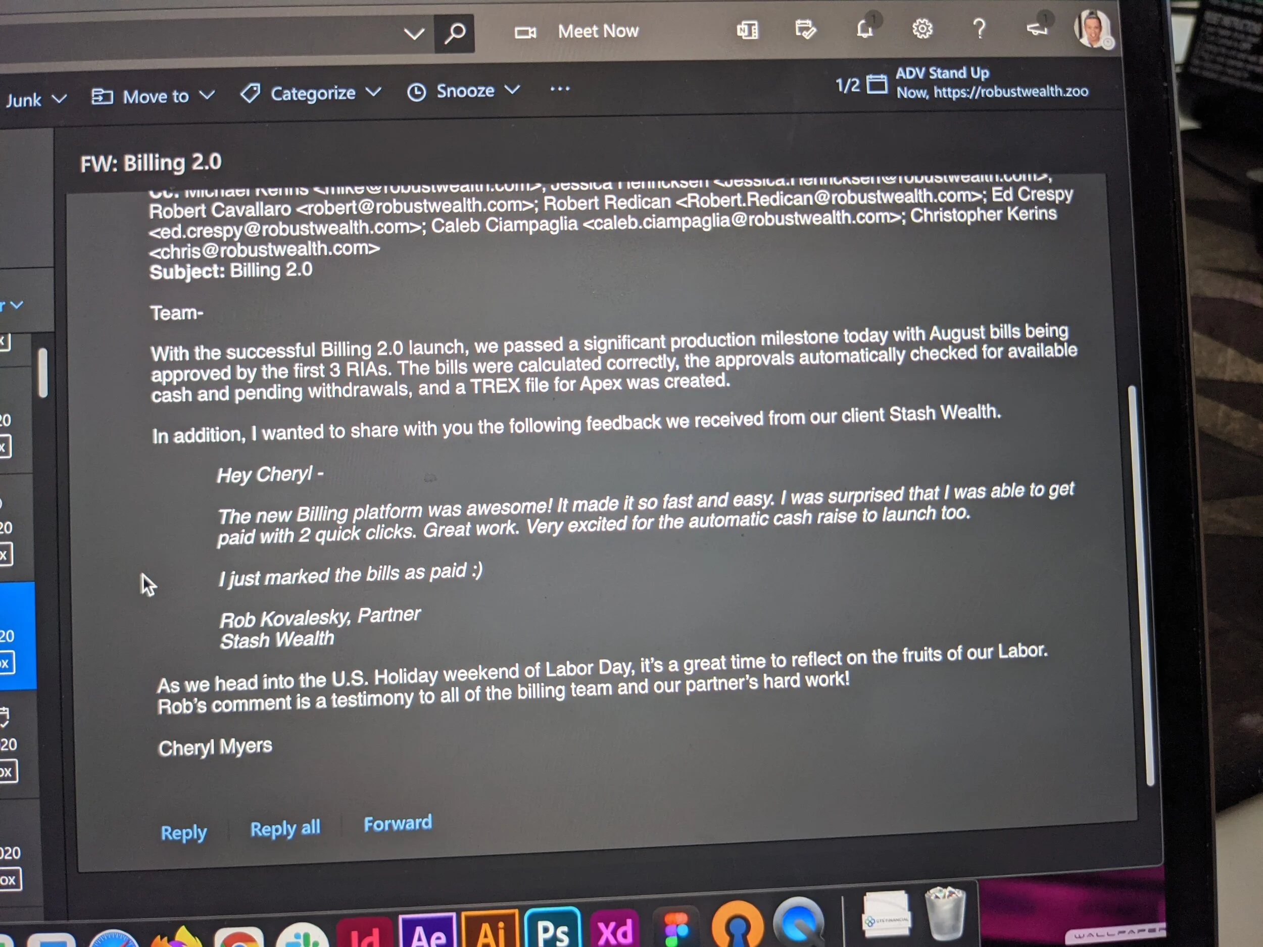
Hey Cheryl (Our Product Manager)
The new Billing Platform was awesome! It made it so fast and easy. I was surprised that I was able to get paid with 2 quick clicks. Great work. Very excited for the automatic cash raise to launch too.
I just marked the bills as paid :)
Key Performance Indicator
Reduction in doing manual summarization from the target users
Increase RobustWealth Revenue
Decisions
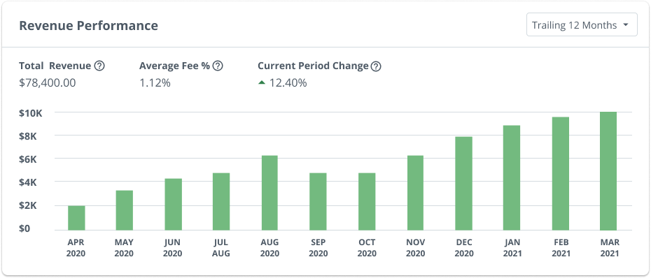
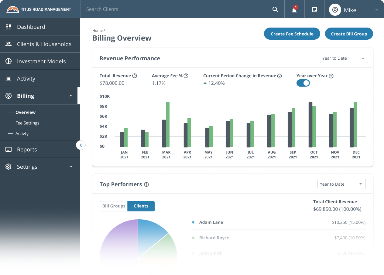
Revenue Performance
We decided to have the Trailing 12 months as the default because it will fill up all the axis and it is the most requested from the Financial Advisors that we presented to and include in this Phase 1.
For the phase 1 build of this feature and as agreed by the Product and Microservices team, we will have:
Trailing 12 Months (Default)
YTD: This option will allow the advisor to do a Year over Year Comparison
Prior Year
For phase 2:
I suggested applying a different Chart Javascript called AMcharts that is very flexible and intuitive for long timelines and custom date ranges. Filters that we are adding in the future:
All-time
Custom Date Range
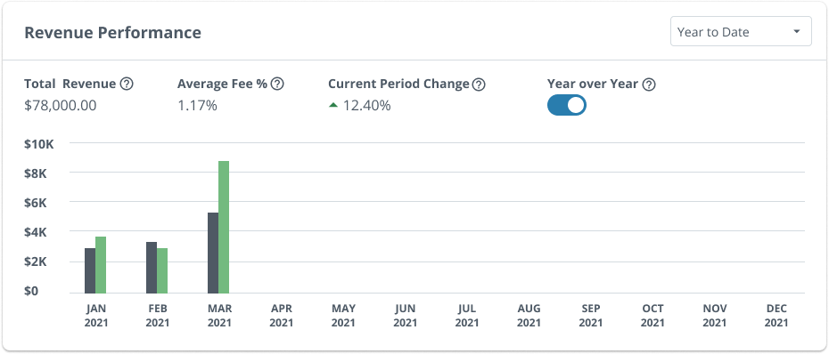
Year over Year
This is the most exciting feature that I discussed with the group and Advisors, as all of the existing firms will be able see their previous billing and compare it to their current billing revenue performance by year to date.
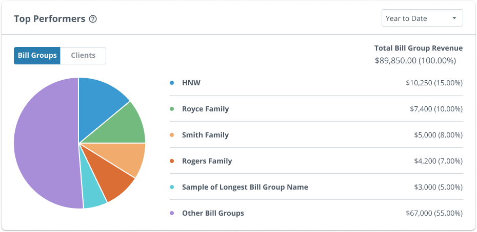
Top Performers
For experience this used to be a Donut Chart, and I recommended to the team and we decided to change it to Pie chart because I don’t want to confuse it with the current Asset Allocation feature that we have for the Financial Advisors’ Clients(The Investors) as that feature is already best suit for a Donut Chart.
I also made sure with the Product Manager Eric that this will always be a fixed 6 row data items so that we won’t get any weird white space below t he donut chart.
Though from a user test result we found a thing that got one of the tester notice that the dots legend before the data names are too small which also we agreed to make it bigger in the next update.
© 2021 Edwin Rosete.